
Contents
If you have any questions or comments, don't hesitate to .
Photo permissions: Photographs by Jacqui Small, from the book, Perfect Neutrals, by Stephanie Hoppen, first published in the United States in 2006 by Watson–Guptill Publications.
Eggshell, biscuit, almond, mushroom; these naturally occurring neutrals are well known. But mint? Watermelon? Cobalt? How can anyone call them neutral? Gallery owner and author Stephanie Hoppen challenges our assumptions about neutral colors by explaining how they work, as foregrounds, backgrounds, highlights, and accents.
With large color and texture swatches, as well as real–world examples, she makes color schemes instinctively understandable and consequently less daunting. The reader can literally compare paint and fabric samples to the pages in the book and get a good idea of how they will transfer to a full–sized room.
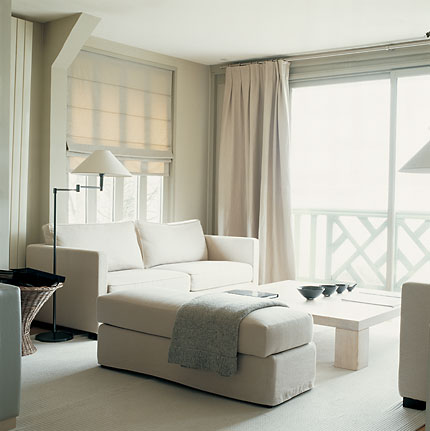
The learning experience begins with her chapters on whites and grays. She shows how color casts in familiar neutrals make subtle and exciting contrasts. Traces of blue, green, and yellow blended into white or gray tones, and combined with rich textures and dramatic accents, can fill rooms with light and dimension.
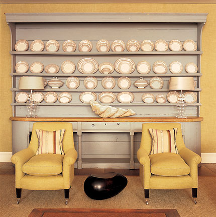
Then Hoppen suggests the reader “forget about boring beige,” and shares her ideas on the use of greens and blues. “If green were not neutral,” she says, “gardens would always look ghastly.” Her examples of tone–on–tone effects with modern, retro, and vintage styling, using both original and traditional palettes, show the reader how to choose stronger colors with confidence. Combined with glass, wood, and vegetable fibers, these colors can bring the emotional comfort of nature indoors, or create a backdrop for a civilized and elegant scene. The deeper tones can take on the contrasting function of black without its severity.
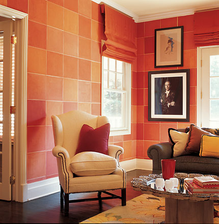
As our understanding of color deepens, Hoppen invites us to see red, yellow, and orange as never before. These colors, sometimes loud, sometimes hot, convey a range of other moods in the rooms she shows us. While admitting that some skill is required to use the most saturated of warm hues, she engages us with examples of successful applications. Off–pinks lose their candy–sweetness and warm up an urbane, mature atmosphere. “My feeling,” she says, “is that if you are going to use pink, use it with bravura and style rather than with elderly caution.” Shades of fire magnify a sunny wall. Multiple fruity reds are layered and edged to soften and relax rather than excite.
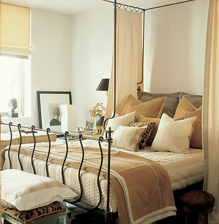
Perfect Neutrals winds up with a discussion of the many shades of brown, and by this time, the reader can anticipate the lesson. “These are the colors of warm wood and natural fibers,” the author says, “so it’s almost impossible to make a serious error when decorating with them.”
In a conversational tone, Hoppen reaches out to readers by describing scenes and elements we can all visualize. Then she takes us on a journey, gradually moving from familiar neutrals to those with stronger color casts, until we come to see how surprisingly vivid hues behave, in the way neutral colors do, to provide unifying themes.
Return to Home by Design
Shirley Nelson, ALHS
425.765.4912 ·
Hallmark Realty Corporation
101 Lake Street S. · Kirkland, WA 98033
fax: 425.889.0607
© 2006, 2007 Odin Enterprises, Inc.
Disclaimer & Site Credits